In this post, you will learn all about Candlestick Price Chart to trade stocks, commodity forex, or crypto. No matter if you’re a beginner or a pro, by the end of this blog post, you’ll be able to…
💲 Understand Price Action
📈 Identify Market Trends & Patterns, and
💡 Ability to Take Better Trading & Investment Decisions
🚀Learn candlestick charts patterns for day trading, swing trading, and long-term investments
Let’s dive right in.
Take a quick look at the topics we are discussing.
Why Price Chart Is Important?
Before jumping to anything firstly, empty your mind and ask yourself why we need to study the “Price“
#Why do We Need to Study the Price?
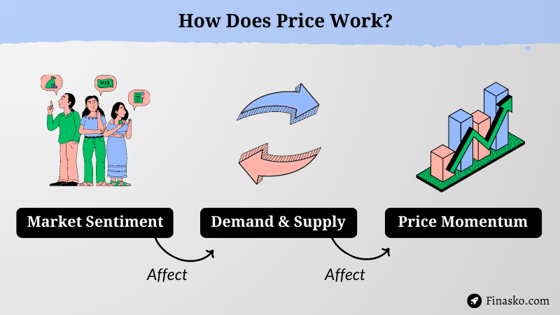
So basically, the price refers to the current market value of financial assets, like stocks, commodities, currencies, etc.
This value is directly affected by their demand and supply, which is influenced by factors such as fundamentals, news, market sentiments, and human emotions.
Look at the image “How does price work” ->
Now the one potential way to make money in the financial market is Trade The Price of Assets.
This strategy is simple – buy and sell assets, aiming to capture the price difference between two separate periods.
For Example – “Imagine you buy a stock for $100 at 10:15 am, and after five minutes, its value increases by $2. If you sell it for $102 at 10:20 am, you will earn a profit. However, if the stock price drops by $1 and you sell it for $99, you will lose money or face a loss.”
Learn: How to Trade with VWAP Indicator
Price Action: Price Covers Everything
In trading or investing, price plays a major role and reflects all information, including fundamentals, news, sentiment, and other factors.

I always believe that prices move first and fundamentals come second.
– Paul Tudor Jones (Hedge Fund Manager)
And to make smarter decisions about buying and selling assets, our priority is to look out for “Price Behavior” – Where Technical Analysis or Studying Price Charts comes into play.
Do you get it? Right
If not then, feel free to ask your questions in the comment box or reread the content to understand it better.
Chart Types & Technical Analysis
In simple words technical analysis is a method of studying the historical and current market data of assets, such as prices and volume, using a variety of tools and indicators.
By doing this, you can identify patterns, trends, and levels of support and resistance. This will help us to predict future price movements and determine when to buy or sell assets to maximize profit.”
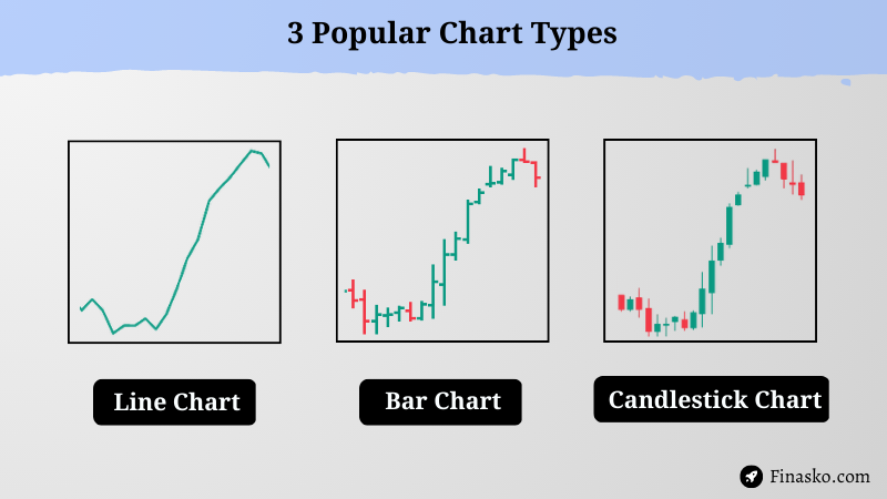
Here are 3 popular charts to observe price behavior in the market…
Don’t worry I just make this easy for you.
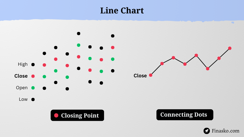
#1 Line Chart
A line chart is a really easy way to see how the price has been moving. It’s made by connecting the dots of the closing price at different times.
For Example – If you are utilizing a 5-minute line chart, it implies that only the closing price for each 5-minute interval is displayed on the chart. It doesn’t matter where are the open, high, and low points of price within that interval.
Pros – Line charts are easy to read and good for beginners.
Cons – But it’s not the most effective tool to checkout stock volatility and analyzes price behavior.
#2 Bar Chart
Compared to line charts, bar charts provide more detailed information on stock prices. They display four types of bars for opening, closing, high, and low prices.
The bars have horizontal lines that represent the opening and closing prices, and vertical lines that indicate the highest and lowest prices.
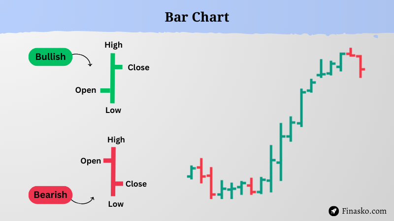
Pros – A bar chart is better than a line chart in the way of analyzing stock volatility and behavior.
Cons – But it’s really difficult to read and understand.
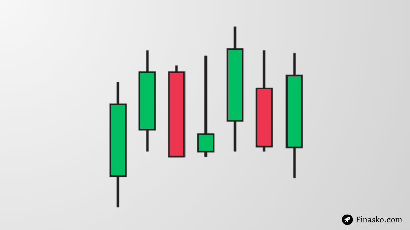
#3 Candlestick Chart
Candlestick is a great chart tool discovered in the late 1700s by a Japanese man (Homma), who need to understand the relationship between Rice Prices and Demand-Supply.
As the name suggests it looks like a candle with a body & wick. Every candle shows the opening, high, low, and closing price of any security during a given time and tells a different story about price.

Pros – Their simplicity and effectiveness have made them a popular tool for technical analysis.
Cons – However without context this gives you false signals and may not be accurate every time.
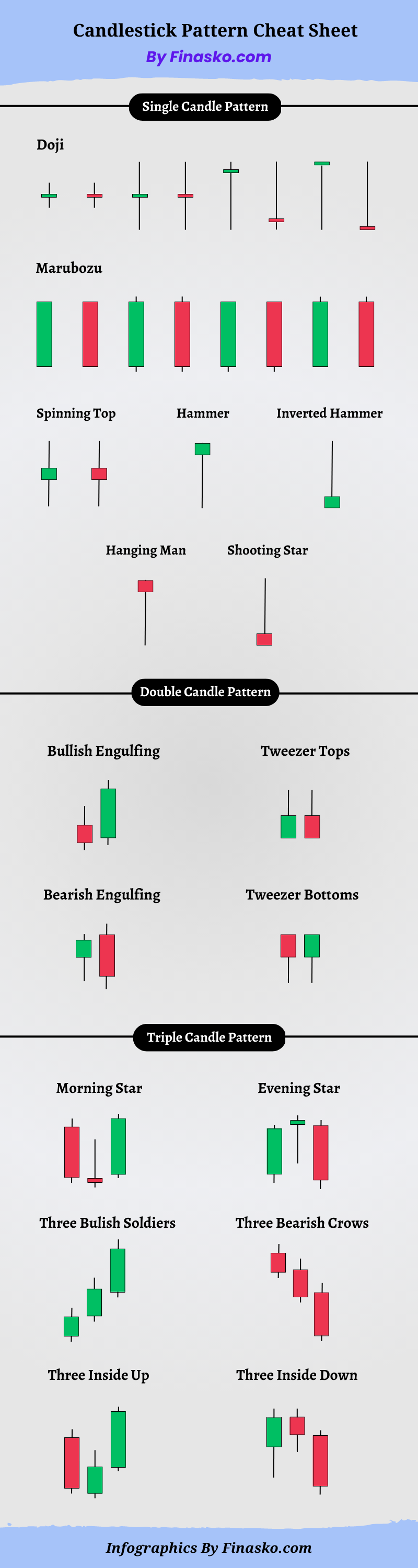
Candlestick Chart Patterns (Cheat Sheet)
In this sanction, you will learn a lot about candlestick patterns.
There are 3 types of candlestick patterns ->
- Single Candle
- Double Candle and
- Triple Candle
Each pattern provides valuable insights into how prices behave and the emotions of market participants.
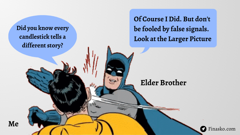
“A few years ago, when I showed this candlestick cheat sheet for the first time, I understood a bit of it.
I remember I asked my elder brother, (who has been in the market for a decade):
Did You Know That Every Candle Tells a Different Story?
How To Read Candlestick Chart
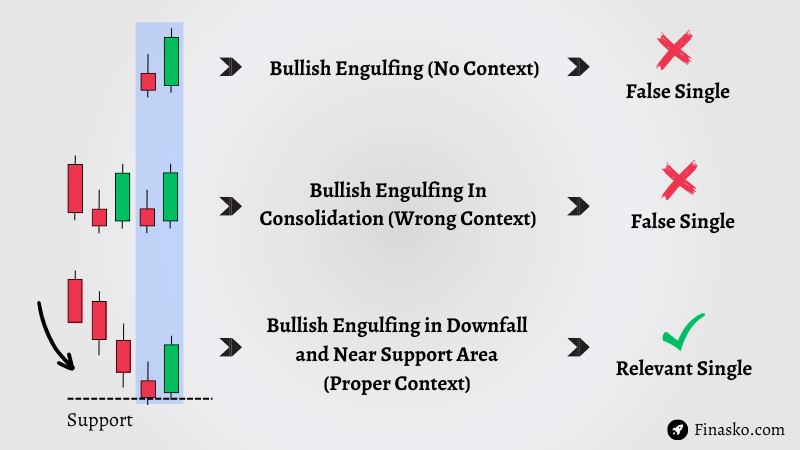
The most important part of this blog post is “How to Read Candlestick Chart” without getting false signals.
As I told you each candlestick has its meaning, but without proper context, it’s indecisive.
It’s like concluding a book by just reading one page of it – you need the whole story or a bigger picture to make sense of it.
Let me explain this ->
Hope you get my point.
Now you must be thinking that “What Are The Contexts I Can Use To Read Candlestick?“
So for that, you can use…
- Trendline
- Support & Resistance
- Moving Average and
- Relative Strength Index
#Support & Resistance
Quick intro for those who don’t know about the support and resistance. Support and resistance levels are important in trading because they indicate where buyers and sellers are active.
Check out this image…
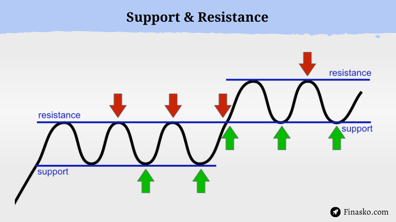
Support – Think of support as a floor where buyers have significant control over the market, resulting in high demand for an asset and preventing prices from dropping below that point.
Resistance – On the other hand, resistance is like a ceiling where sellers create high supply pressure that prevents prices from breaking through that level.
When you combine a candlestick chart with support and resistance levels, you can enhance your decision-making process to buy or sell an asset.
Here are a few examples –>
#1 Doji Candle
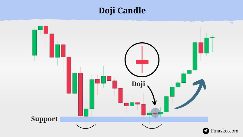
A Doji candle has a small body, a long wick, and opening and closing prices that are near the same level as shown in the picture.
A Doji candle itself does not provide clear direction or is indecisive. However, when analyzing this with support and resistance levels, one can gain a better understanding of its potential movement.
#2 Shooting Star Candle
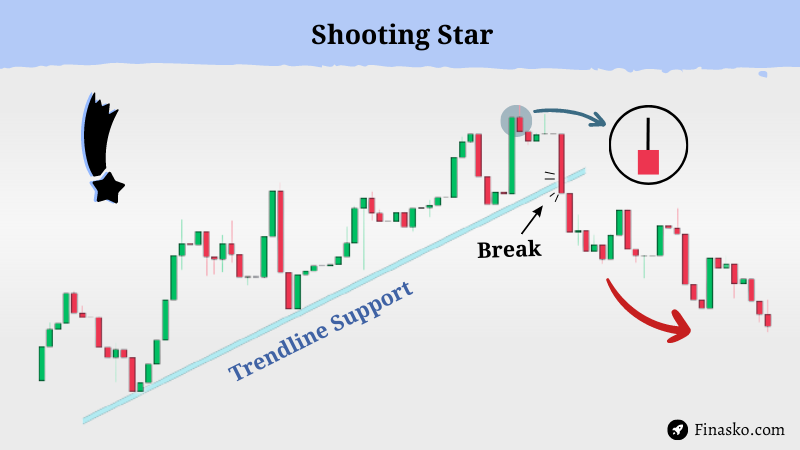
This candlestick is called a Shooting Star Candle (ミ✫), which has a small body below and a top wick. It indicates that sellers are getting ready to take over.
However, it’s important to remember that you shouldn’t base your decisions on just one candlestick. Instead, consider using a trendline support and breakout strategy.
#3 Spinning Top Candle
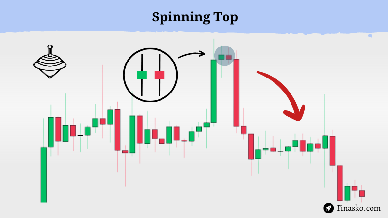
A Spinning Top Candle shows a small body and long upper and lower wicks. It indicates indecision between buyers and sellers and can signal a potential trend reversal or consolidation.
#4 Hammer Candle
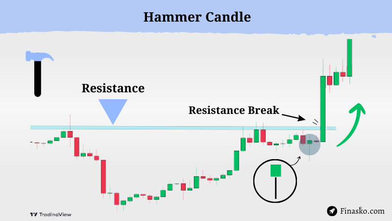
The Hammer Candlestick Pattern 🔨 looks like the real hammer with a small body on the upside and a long wick at the bottom. Candle opens on the top but experiences a sharp decline but after all this, it’s close above the opening price.
Hammer candles as a bullish signal because it suggests that the buyers are gaining control of the market and pushing the price upwards. If the price continues to rise after a hammer candle, it’s usually a strong indication that the bullish trend will continue.
#5 Three Bullish/White Soldiers
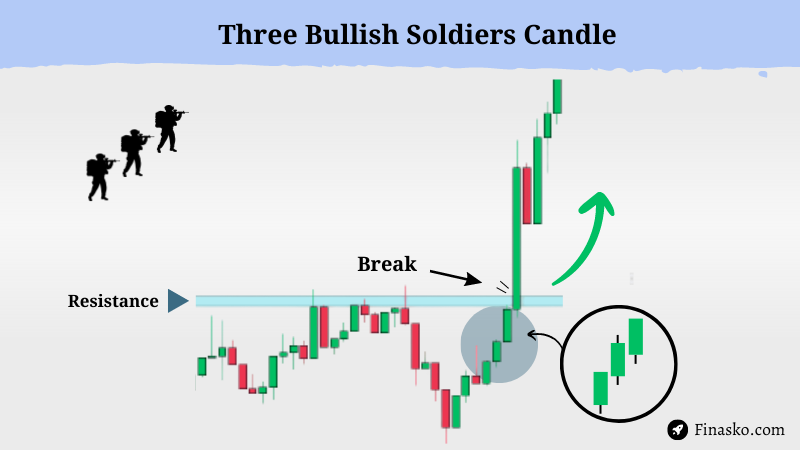
This pattern formed when three candlesticks with long bodies and small or no shadows appear one after another, all closing near their highest points.
They look like three soldiers marching higher together, which suggests that the buyers are getting stronger and taking over the market. This pattern often indicates a potential bullish reversal in a downtrend.
Oh, you’re still here… Great! Here’s a bonus for you.
3 Pro Tips To Master Candlestick Chart
Using Candlestick Charts can assist you in identifying what’s happening in the market. However, it’s important to not depend on that.
To understand the overall picture of the market, you have to practice and gain experience over time.
That’s why I’m sharing these 3 pro tips that I used in my early day to improve my chart reading skills, which you can also use.
#1 Zoom Out
There is a famous quote in the Stock Market “When In Doubt, Zoom Out”
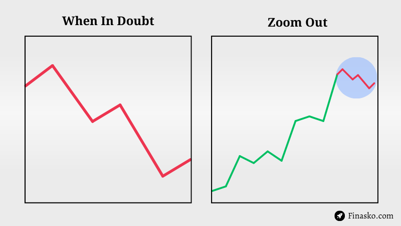
It simply means that If you’re confused about market trends in a short time frame, such as 5 or 15 minutes, then consider zooming out and looking at 1-hour or 1-day charts instead. This will help you avoid short-term market noise and focus on long-term trends and market structure.
#2 Use Indicators
As I mentioned earlier, a single Candlestick or Chart may not provide a complete picture of the market. That’s why we use indicators by combining them with candlesticks so we can analyze market trends, momentum, and support and resistance levels.
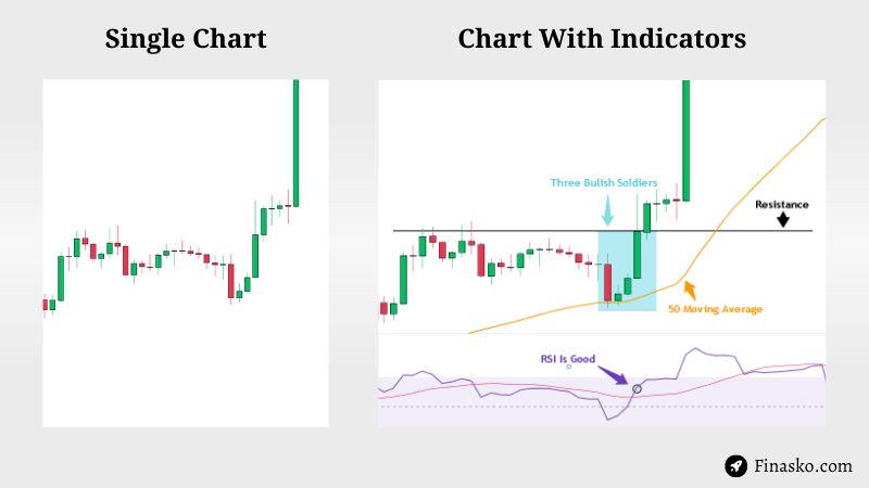
For example, If we see a Three Inside Up reversal pattern on the chart, we can use indicators like the moving average or the Relative Strength Index (RSI) to confirm the trend change and know when the market is overbought or oversold.
If you want to go deeper, then here are the top indicators used by pro traders that you can also learn and apply…
- Bollinger Bands
- Ichimoku Cloud
- Relative Strength
- Standard deviation
- Stochastic Oscillator
- Fibonacci Retracement
- VWAP and Anchored VWAP
- Moving Average Convergence Divergence (MACD)
#3 Practice Paper Trading
Paper trading is a helpful tool for beginner traders to practice and test their strategies with a dummy account. You can use Tradingview‘s paper trading feature, which gives you $100,000 virtual money to practice trading.
As demonstrated in this GIF where I am testing my Bitcoin strategy, you too can benefit from this tool.
Conclusion
As we come to the end of this “How to Read Candlestick Chart” post, I want to ensure that you have learned valuable information to improve your trading skills.
Here are a few things to keep in mind:
- Learn every day.
- Do your research and develop a strategy.
- Don’t blindly follow news, tips, or advice from random sources.
- Start with a small amount of capital at the beginning.
- Always do what works best for you.
I hope you found this post helpful and informative. 🙋♂️
If you enjoyed reading it, please leave a comment 💭 and share 📢 it with others so I can know your thoughts.
Thank you for taking the time to read it! 🙏
0 Comments